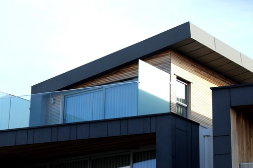
Mid-century modern is a style of architectural design that first became popular in post-World War II America. It’s a style that remains popular to this day for homebuyers, designers and home builders. The key features of mid-century modern design can apply to both interior and exterior design. You can also find these elements combined with other styles for unique and contemporary looks.
It’s easy to spot a particular style once you know what to look for. Here are the 5 basic architectural elements you can use to recognize a mid-century modern style home:
Roofline
Bold angles and geometric shapes are a staple of mid-century modern architecture. The most obvious examples are the shapes and orientation of roofs these homes have. Purely flat horizontal roofs are iconic mid-century modern, as are those with multiple “steps” of roof levels without gables. Diagonal lines are also common in mid-century modern roofs, but you’re not likely to find perfect symmetry. Angled roofs usually shallow even for split-level homes and are most often asymmetrical.
Large Windows
One of the leading philosophies in mid-century modern design was blurring the line between indoors and outdoors. The most noticeable result of this is the prevalence of floor-to-ceiling windows. Following the roof design, windows are rectangular or asymmetrically angled to provide a clear, expansive view of surrounding environment and capture lots of natural light. Mid-century modern homes have multiple points of access, usually as sliding glass doors, to the home for an easy transition between indoor and outdoor lifestyle.
Changes in Elevation
While most mid-century modern homes are a single story, they typically contain multiple levels of elevation inside. Shallow steps up or down are used to signal transitions from one area to the next. There may be short staircases between levels or a single step, sometimes accompanied by partial walls or partitions, also referred to as pony walls or knee walls, to add depth to the space while preserving the open floor plan view.
Juxtaposition & Contrast
While forgoing embellishment and ornamentation, mid-century modern architecture does creative visual interest by using contrasting materials. Common exterior materials include stucco, concrete, brick, glass, stone or wood. Often multiple materials will be used together and while contrasting combinations are a key aesthetic element, they rarely stray into the realm of pure decoration.
Functionality & Simplicity
Above all, mid-century modern style values functionality over pure aesthetics. A mid-century modern home will have very minimal embellishment in interior and exterior features. When not covered in windows, facades and walls are often completely flat, creating bold geometric shapes without siding or paneling. Paneling or siding, when used, is typically understated and homes with “accent” walls made of a contrasting material are still relatively simple. This design element carries into the layout of the homes as well: open floor plans with efficient multi-functional spaces are key. Using half walls and different floor elevations to separate and define spaces still allows for an efficient flow of air, light and contact within the home.